COVID-19 at a Glance: Infographics
 Dr. Avriel Licciardi, Associate Editor
As the novel coronavirus 2019 (COVID-19) pandemic continues to evolve, new information is obtained and disseminated each day. Here, LetPub provides a collection of infographics (data-driven visuals) that explores various aspects, including clinical issues and cultural concerns, related to the ongoing crisis. Below we provide contextual resources (i.e., understanding how the virus works) as well as access to real-time dashboards and up-to-date data. The COVID-19 resources provided in this article are all from fact-driven, reliable sources. At a time when misinformation is prominent, we encourage sharing these COVID-19 resources to friends, family, and colleagues.
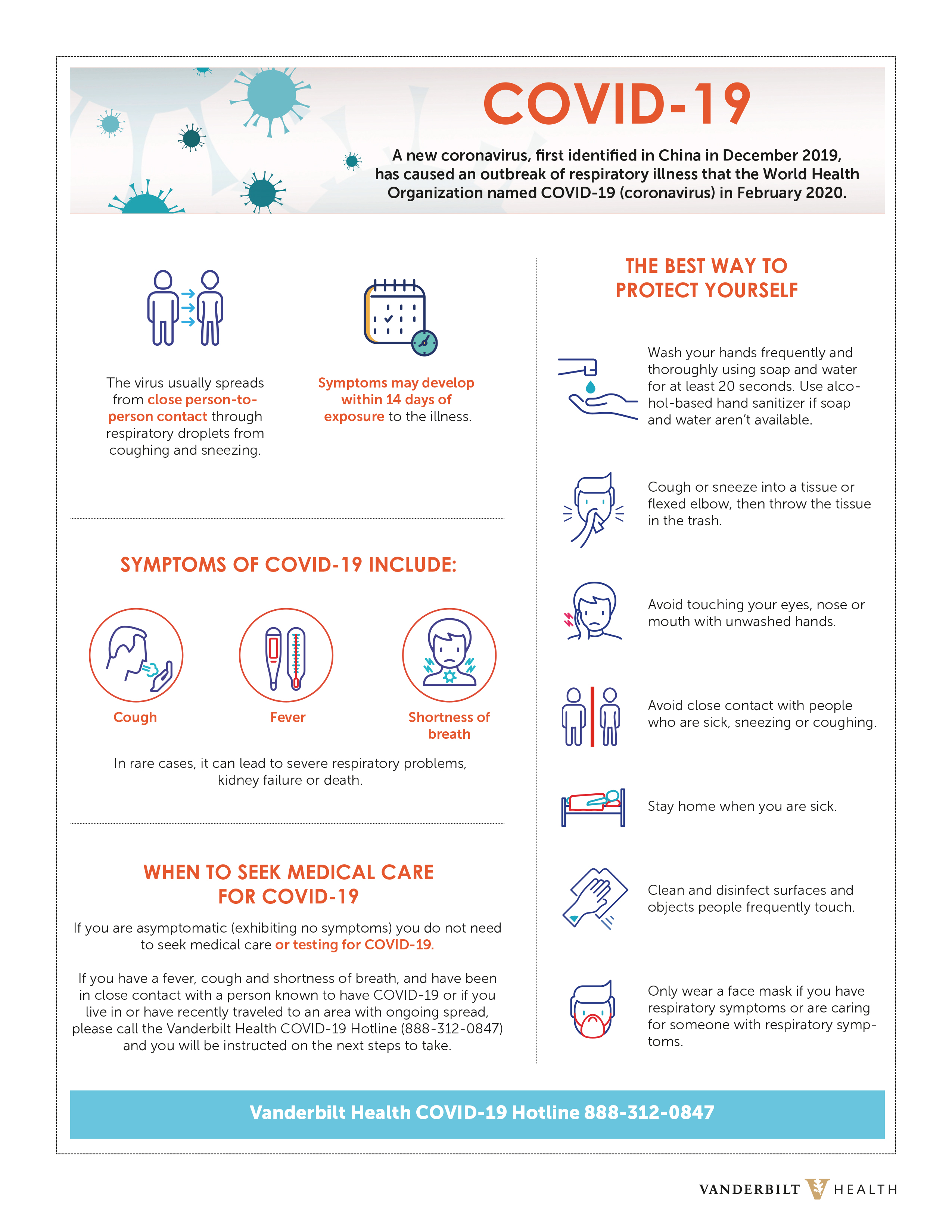
We recommend this scrolling infographic by the South China Morning Post, which is an excellent resource to learn the more familiar types of coronaviruses, how they spread, and how infection occurs in the human body. For some quick basics, including common symptoms of COVID-19, refer to the following infographic:
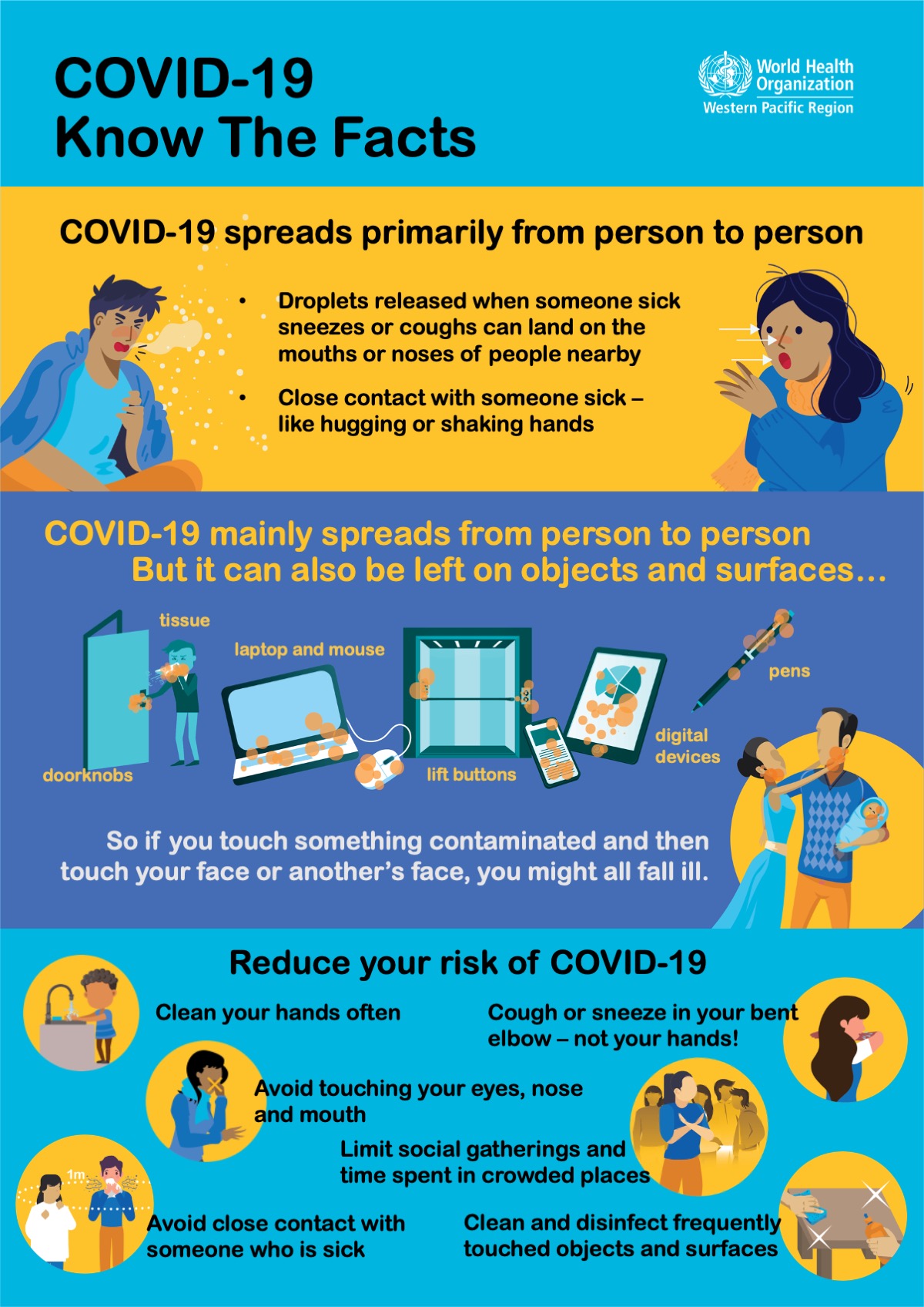
Research indicates that COVID-19 is spreading easily and sustainably from person-to-person and in the community (“community spread”). It may also be possible that a person can contract COVID-19 by touching a surface or object that has the virus on it and then touching their own mouth, nose, or possibly their eyes.
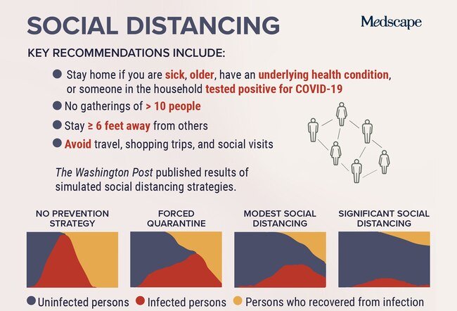
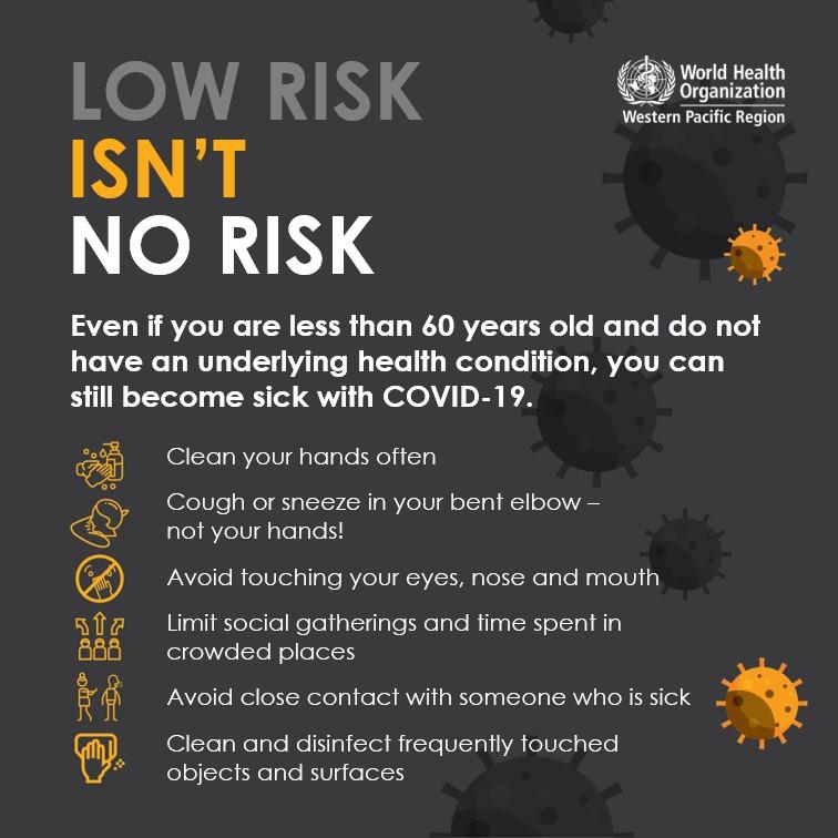
Current recommendations are to participate in social distancing strategies as well as protecting ourselves (and others) with practicing good hand and respiratory hygiene.
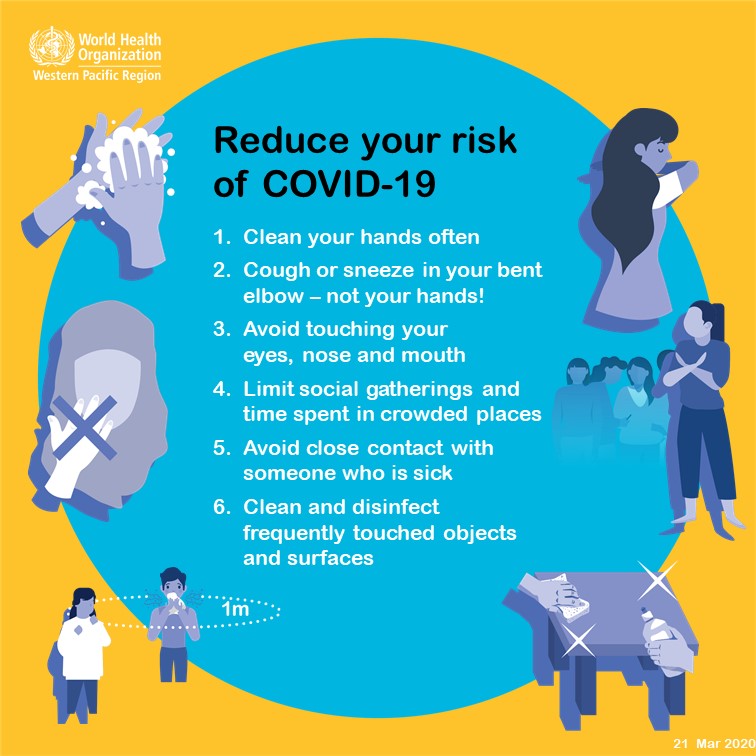
Fighting COVID-19 is our joint responsibility. Protect yourself and others: make these 6 simple precautions your new habits.
COVID-19 is often more severe in people 60+ years old or in individuals with underlying health conditions like lung or heart disease, diabetes, or conditions that affect their immune system.
Remember to do your part to protect those who are at most risk.
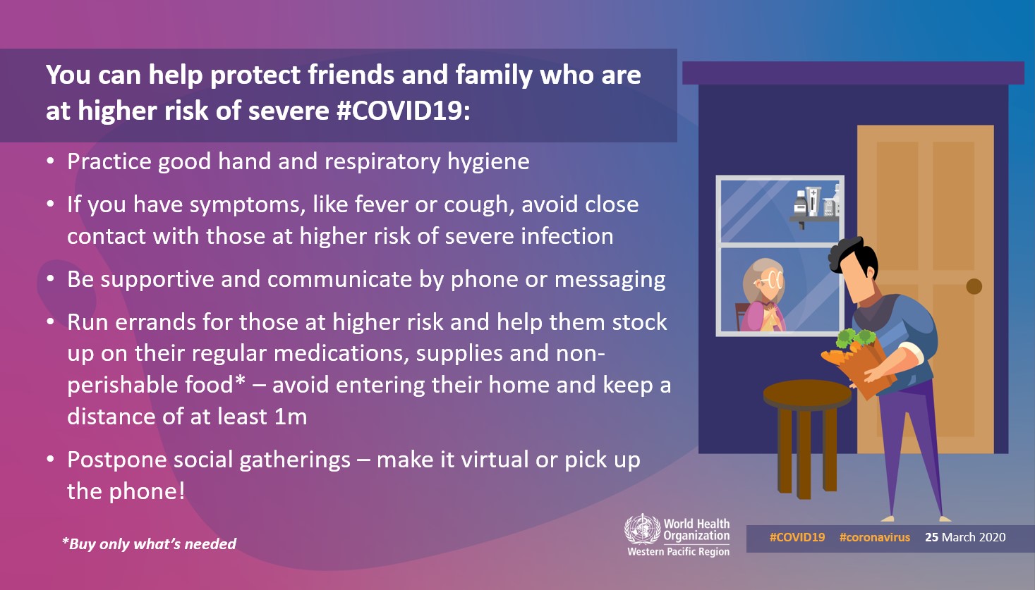
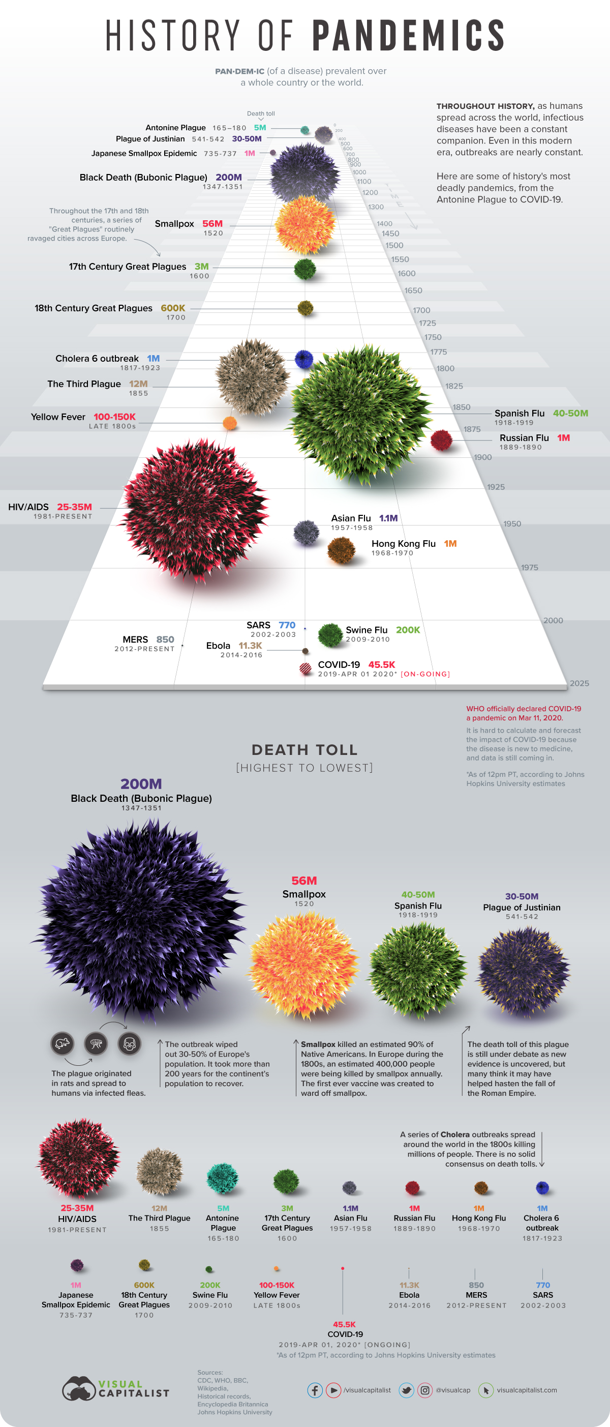
It is important to know that outbreaks are nearly constant in the modern era; however, not every outbreak reaches the pandemic level. The visualization below outlines some of history’s most notable pandemics (and how COVID-19 fits into the mix).
Interested in the most recent data?
Stay up to date with emerging COVID-19 related data via the Johns Hopkins Coronavirus Resource Center. Explore their interactive web-based map to track cases of the virus worldwide.
Our World in Data also has an excellent interactive graph, which plots the progress of different countries in “flattening the curves” of COVID-19 infections. For additional information on COVID-19, we recommend the following resources: Centers for Disease Control and Prevention, World Health Organization, Medscape, and Johns Hopkins University.
 Previous Article
Next Article
